This brewery has changed their logo a few times in the last ten years so now none of their assets match. Their social media accounts are using different branding from each other. Also, their current logo is just the skyline of Charlotte and doesn't help if they want to think about branching out to other cities/states. I wanted to solve this problem by bringing everything together and help it fit more with the brewery's history.
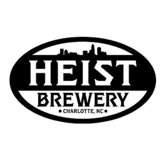
Before
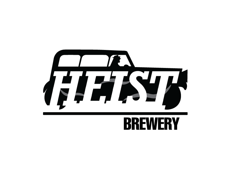
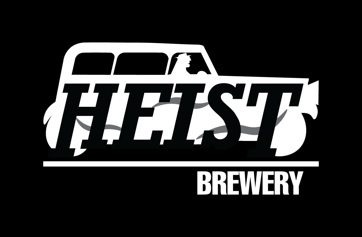
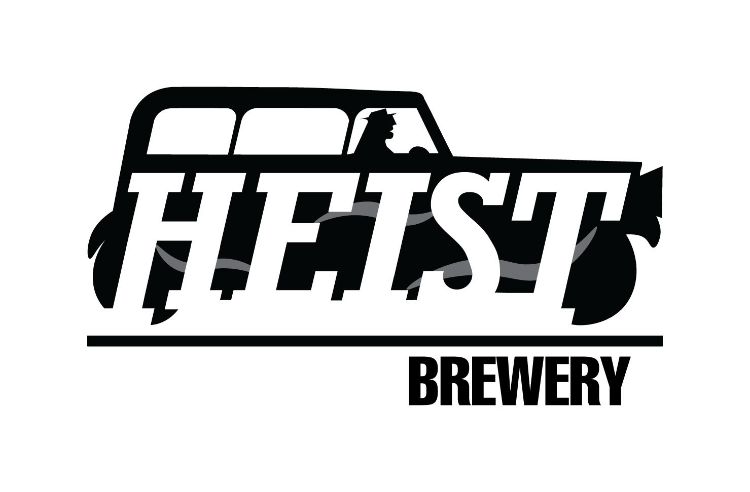
After
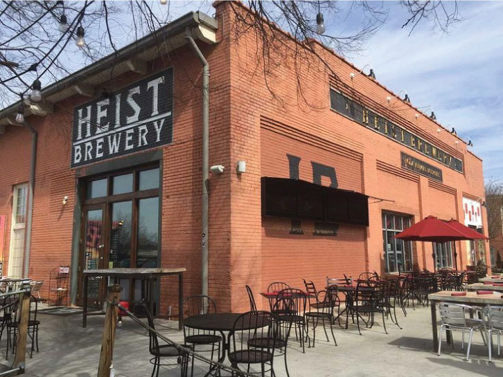
Heist Brewery current location
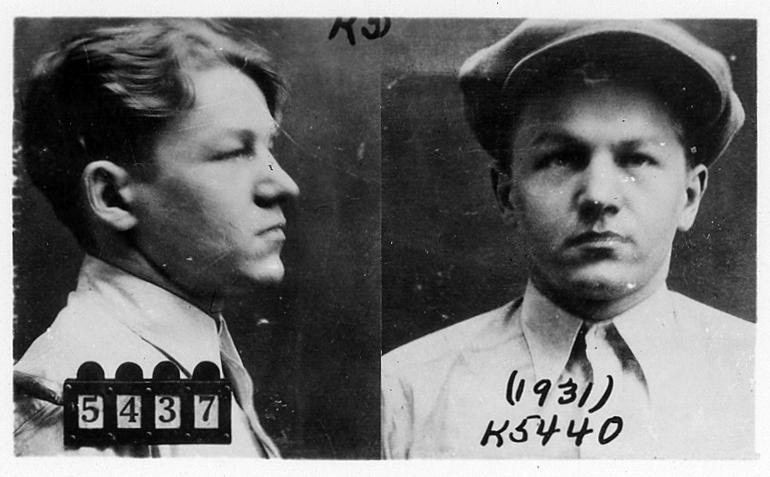
"baby face" nelson, relative of the founder of Heist Brewery
By researching the history of the brewery and how it was named, I came up with this concept. I kept the style of everything in the 1920s by using typefaces (Rockwell and Helvetica) that would have been in newspapers at the time, keeping the colors to blacks and white, and using imagery to showcase gangsters.