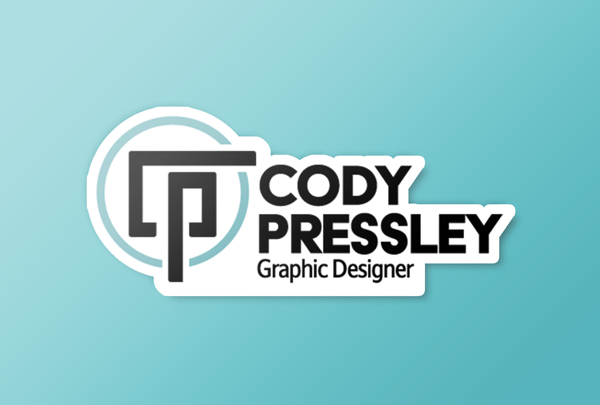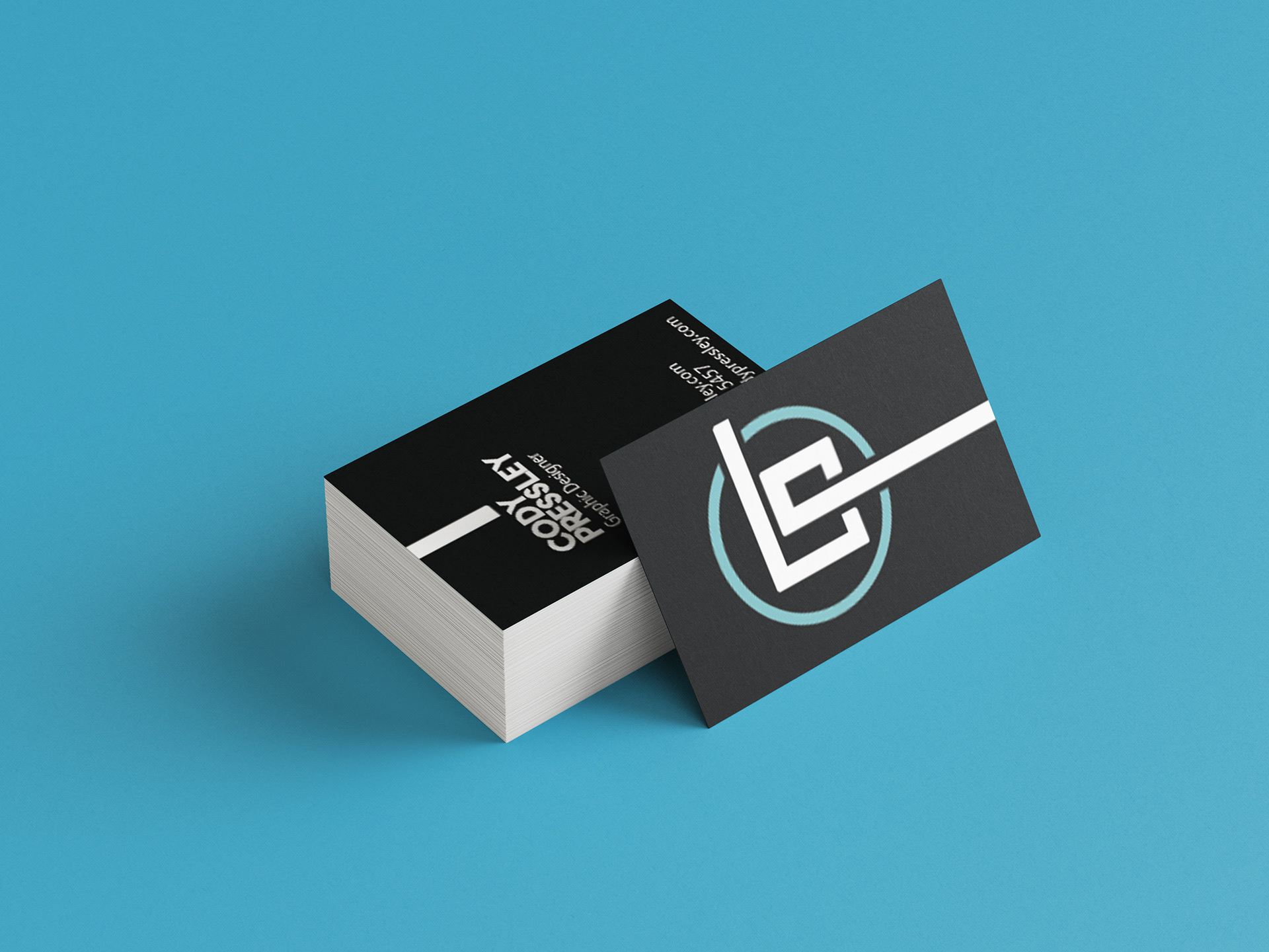
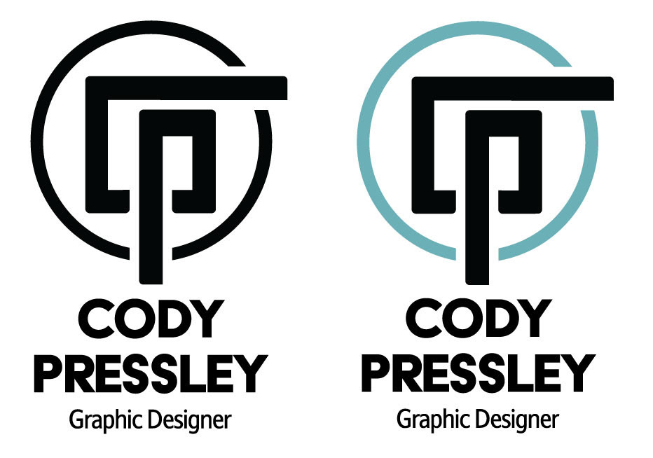
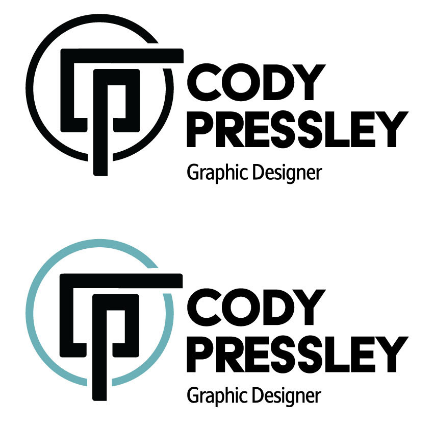
When creating a brand for myself, I looked back at the styles I used and what I wanted to convey about me as an artist. The style I feel best shows me is Minimalist. By using few shapes, it gives more meaning to the art.
I tend to use organic shapes but use geometric shapes when I want to show something of importance. I showed this by surrounding everything in a circle but using straight lines when it comes to my initials. The single path used to create my initials represents my path from where I started as an artist to where I am going, by leading to the text graphic designer. For the typefaces, I wanted something geometric since the logo was mostly organic.
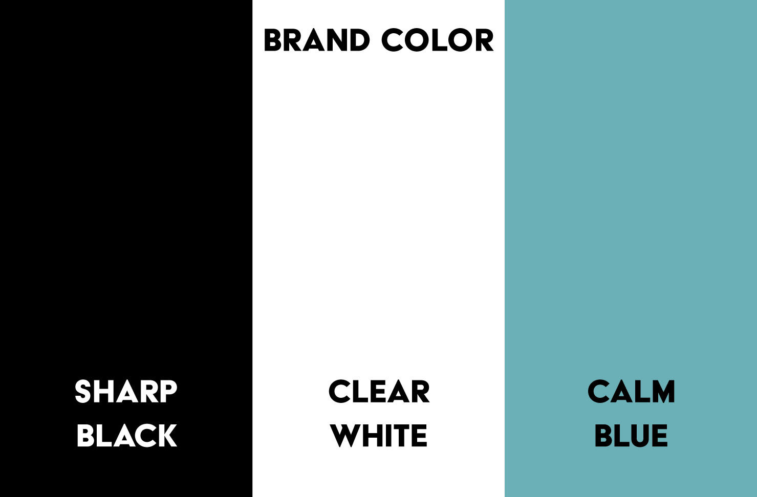
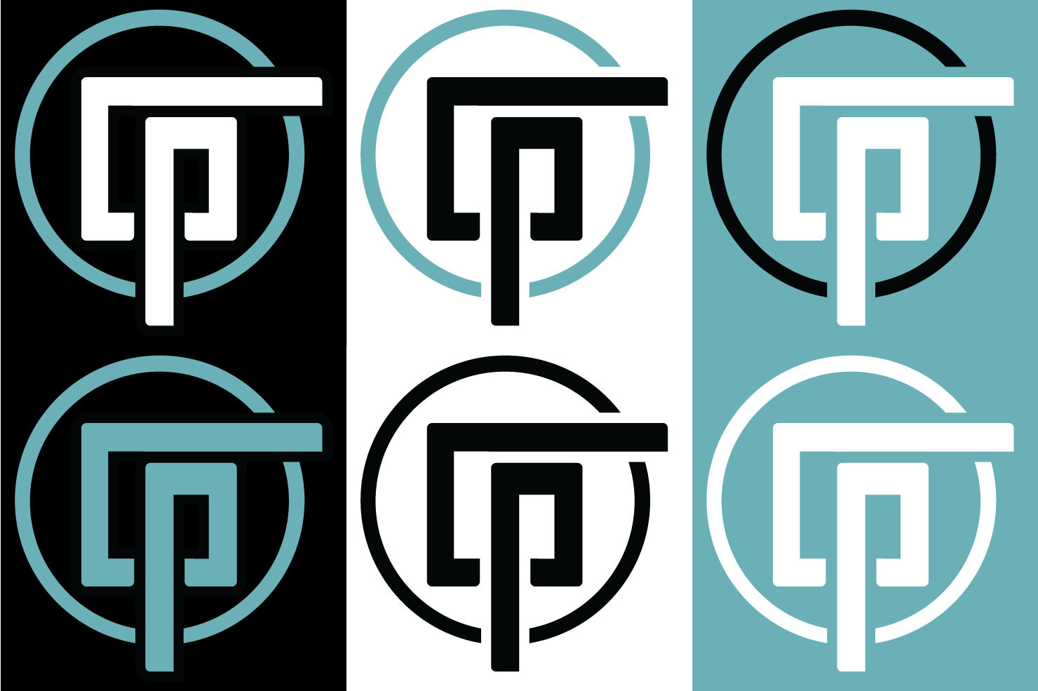
I chose rich black, teal, and white as my colors to represent me, blue has a cool/calming effect when you look at it and that describes my personality. Black when used with light colors helps draw focus and white gives it a nice clean look.